Disclosure: We may earn money from the companies mentioned in this post, but we only recommend brands that we truly love and trust.
June 15, 2026
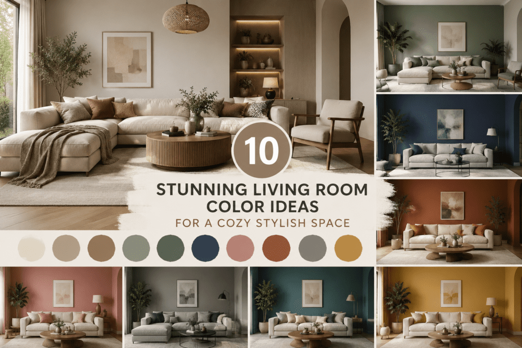
Picking living room color ideas sounds fun — until you’re standing in front of 47 paint swatches and nothing looks right. Been there. The good news? There’s actually a logical way to think through color, and once you nail it, everything else — the furniture, the decor, even that awkward corner — clicks into place.
Key Takeaways
- Q: What are the best living room color ideas for a cozy space?
A: Warm neutrals like soft cream, greige, and sage green consistently create the coziest living rooms — they work with almost any furniture and feel good in both natural and artificial light. - Q: What paint finish should I use in a living room?
A: Eggshell is the go-to finish for living room walls — it’s washable, slightly reflective, and hides minor imperfections far better than flat paint. - Q: Who is this guide for?
A: Anyone decorating or refreshing a living room, whether you’re starting from scratch or just tired of staring at the same beige walls you’ve had since 2018.
Quick Navigation
- 1. How to Start Choosing Your Color Palette
- 2. Warm Neutrals — The Crowd-Pleasing Classic
- 3. Sage Green — The Color Everyone Is Choosing Right Now
- 4. What Colors Go With a Grey Sofa?
- 5. Soft Blue — Calm, Classic, Timeless
- 6. Dark & Moody — For the Brave (and the Cozy)
- 7. What Paint Finish Works Best in a Living Room?
- 8. How to Decorate a Small Living Room With Color
- 9. What to Put in the Corner of a Living Room
- 10. How to Make Any Living Room Feel Cozy
- 11. The Products That Bring It All Together
- Before You Go
How Do You Start Choosing Living Room Colors?
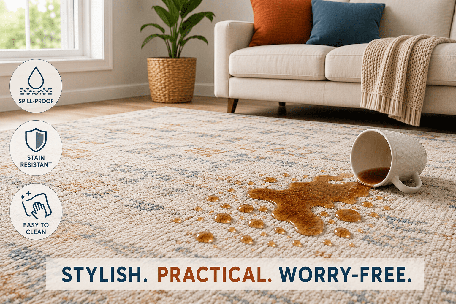
Start with what you already own. Your sofa, rug, and flooring are the three anchors of your living room — and they’re almost always too expensive to replace just because you changed your mind on wall color. Before you even look at paint chips, identify the dominant tone in each of those pieces. Warm undertones (brown, gold, red) need warm paint colors. Cool undertones (gray, blue, silver) can handle cooler hues.
The second thing to check is light direction. A south-facing living room gets warm, strong sunlight all day — you can go cooler with the paint and it’ll still read as inviting. A north-facing room gets cool, flat light, which means warm paint colors will save you from a space that always looks a little gray and depressing. (Ask me how I know.)
According to Better Homes & Gardens, the single biggest mistake homeowners make when choosing living room paint is selecting a color in the store under fluorescent lighting, then being surprised when it looks completely different at home. Always test first.
” According to a 2023 Houzz survey, paint color is the most common living room update — chosen by 54% of homeowners who renovated their living space that year — making it the single highest-impact, lowest-cost change you can make.”
The good news about peel-and-stick paint samples is they’ve genuinely changed how you test color. Products like the Samplize Benjamin Moore Pale Oak OC-20 (more on that below) let you see a real-size swatch on your actual wall, in your actual light, without painting a single stroke. It’s the most honest way to test color before committing.
Frequently Asked Questions
Q: Should I pick paint color before or after furniture?
A: After — always after. It’s far easier to match paint to existing furniture than the other way around. If you’re starting completely from scratch, choose flooring first, then furniture, then paint. Paint is the most flexible and affordable element in the room.
Q: How do I know if an undertone is warm or cool?
A: Hold the paint chip next to a pure white piece of paper. If the color shifts toward yellow, orange, or red against white, it has a warm undertone. If it shifts toward blue, green, or purple, it’s cool. This works for both paint and fabric swatches.
Warm Neutrals — The Crowd-Pleasing Classic That Always Works
Warm neutrals — cream, greige, soft beige, pale oak — are the most reliably livable living room color palette out there. They don’t compete with your furniture, they age well, and they read as “designed” without requiring you to commit to a dramatic choice. If you’re not sure where to start, this is where you start.
The most important thing to understand about neutrals is that they’re not all the same. A creamy warm white like Benjamin Moore Cloud White OC-130 behaves completely differently from a cool gray. Cloud White has soft yellow undertones that keep a room feeling sunny and inviting — it’s been one of Benjamin Moore’s bestsellers for years because it works in almost every type of light.
Similarly, Benjamin Moore Pale Oak OC-20 is a popular greige (gray-beige hybrid) that sits right in the middle — not too warm, not too cool. It pairs beautifully with natural wood tones, linen fabrics, corduroy throw pillows, and organic textures. It’s the kind of color that looks effortless even when you’ve worked hard to achieve it.
Samplize Benjamin Moore Cloud White Peel & Stick Color Sample OC-130

- Brand Name: Samplize Sub Brand: Benjamin Moore Color: Cloud White Product Type: Peel & Stick Color Sample Color Number: …
Before painting an entire room, test it on the wall first. These Cloud White peel-and-stick samples are 9″ × 14.75″ — large enough to give you a real sense of how the color behaves in your specific light, morning and evening. Each pack includes 8 samples, which means you can test multiple walls at once. The samples are repositionable and leave no residue. Rated 4.8 stars. ASIN: B0CJT2HJXX.
Fancy Homi 4-Pack Corduroy Throw Pillow Covers — Neutral, 18″×18″

- Corduroy
- Package: 4 pcs pillow covers (NO INSERT) are suitable for indoors. Perfectly fit for the same size pillow insert. Please…
- Exquisite Chic Design: Unique striped pattern adds cuteness to these pillow covers. It’s a nice gift for your families a…
Once your warm neutral walls are sorted, the couch needs texture. These corduroy pillow covers from Fancy Homi nail the modern farmhouse boho look without the farmhouse price tag. The soft ridged texture adds visual interest while staying firmly in a neutral palette — which means they’ll work with almost any wall color in this guide. Set of 4, 18″×18″, hidden zipper, machine washable. Over 6,050 reviews at 4.7 stars. ASIN: B0C2PS76FG.
Sage Green — The Color Everyone Is Choosing Right Now (and For Good Reason)
Sage green has become the most requested living room color of the past three years, and it’s not hard to see why. It sits at the intersection of warm and cool — earthy enough to feel grounded, fresh enough to feel alive. It works with wood tones, linen, leather, rattan, and white trim. It’s basically the golden retriever of paint colors.
The version to look at for living rooms is Benjamin Moore Cushing Green HC-125. It’s a muted, slightly gray-toned sage that reads sophisticated rather than bright. Unlike true greens that can feel aggressive in a living room, Cushing Green stays calm and livable throughout the day. It pairs beautifully with warm wood floors, cream trim, rattan furniture, and navy or terracotta accents.
If you already have a gray sofa, sage green walls are one of the best choices you can make — they warm up the gray without clashing. More on that in the next section.
Samplize Benjamin Moore Cushing Green Peel & Stick Color Sample HC-125

- Samplize Benjamin Moore Cushing Green Peel & Stick Color Sample HC-125
Test Cushing Green HC-125 on your own walls with these peel-and-stick samples from Samplize. Matte finish, non-toxic, water-based. Each pack covers 45 sq ft per quart equivalent — which means what you see on the sample is exactly what you’ll get on the wall. ASIN: B0CJT7VCFN.
SUNBURY 360° Swivel Accent Chair — Green Boucle, 33.5″W

- INNOVATIVE FRAMELESS COMFORT: Breaking away from traditional hard wood, this club chair features a unique NO FRAME desig…
- SMOOTH 360° ROTATION: Equipped with a heavy-duty metal rotating base, this round swivel chair allows you to glide effort…
If you’re going sage green on the walls, consider pulling that color into your furniture in a tonal way. This SUNBURY boucle swivel chair in green is a fantastic corner piece — 360° rotation on a heavy-duty metal base, frameless high-density foam construction, and a skin-friendly boucle upholstery that adds serious texture. It works equally well in a sage green room or against neutral walls. Dimensions: 33.1″D × 33.5″W × 27.2″H, capacity 330 lbs. ASIN: B0GT4YXDXC.
What Colours Go With a Grey Sofa in a Living Room?
A gray sofa is the most common starting point for living room color decisions — and also one of the most misunderstood. The problem people run into is choosing wall colors that fight the gray instead of working with it. Gray is inherently cool and slightly neutral, which means it has more flexibility than most people realize.
The colors that work best with a gray sofa fall into three reliable categories. First: warm whites and creams, like Benjamin Moore Cloud White OC-130 or Pale Oak OC-20. These warm up the gray without clashing, creating a sophisticated contrast. Second: sage and olive greens. A muted green like Cushing Green adds an earthy contrast that makes gray look intentional rather than just neutral. Third: warm blues like Benjamin Moore Van Deusen Blue HC-156, a rich mid-blue that creates a classic, layered look.
What doesn’t work well with a gray sofa? Stark cool grays on the walls (you end up with a room that looks like a waiting room), and most bright colors, which can feel jarring against the sofa’s cool undertone.
Samplize Benjamin Moore Pale Oak Peel & Stick Color Sample OC-20

- Brand Name: Samplize Sub Brand: Benjamin Moore Color: Pale Oak Product Type: Peel & Stick Color Sample Color Number: OC-…
Pale Oak OC-20 is the greige that interior designers reach for when they need something that bridges warm and cool. It sits beautifully next to a gray sofa without going too beige or too white. The pack of 8 samples at 9″×14.75″ is enough to test every wall in the room. ASIN: B0CJT9QLC2.
Frequently Asked Questions
Q: What colour makes a grey sofa look expensive?
A: Warm whites and soft warm greens are the two colors that consistently make a gray sofa look elevated and intentional. Pale Oak OC-20 or Benjamin Moore Cushing Green HC-125 on the walls, paired with warm-toned textured throw pillows in corduroy or boucle, creates a cohesive layered look.
Q: Should living room walls be lighter or darker than the sofa?
A: For a gray sofa, lighter walls almost always work better — they create contrast that makes the sofa a clear focal point. Going darker on the walls is possible but requires more intentional decor layering to prevent the room from feeling heavy.
Soft Blue — Calm, Classic, and Surprisingly Versatile
Blue is the most consistently popular wall color in American homes, and it’s earned that title. The right blue for a living room isn’t electric or navy — it’s something in the middle. A sophisticated, slightly grayed blue like Benjamin Moore Van Deusen Blue HC-156 creates a calm, classic backdrop that reads as both timeless and current.
Van Deusen Blue is a warm-toned mid-blue from Benjamin Moore’s Historic Collection. It has just enough depth to feel intentional without going dark. It pairs exceptionally well with white trim, natural wood floors, cream upholstery, and gold or brass accents. If you’ve been wanting to move away from neutral walls but aren’t ready to commit to something dramatic, this is your gateway drug.
Blue walls also play well with abstract wall art — particularly pieces that incorporate gold or warm pink tones, which create a beautiful contrast against the cool blue backdrop.
Samplize Benjamin Moore Van Deusen Blue Peel & Stick Color Sample HC-156

- Brand Name: Samplize Sub Brand: Benjamin Moore Color: Van Deusen Blue Product Type: Peel & Stick Color Sample Color Numb…
Test Van Deusen Blue HC-156 before you buy a gallon. These peel-and-stick samples show you exactly how the color reads in your light throughout the day — and blue colors in particular shift dramatically depending on sunlight vs. artificial light. Pack of 8 samples, repositionable, no residue. ASIN: B0CJTDT53M.
Framed Blue & Gold Abstract Canvas Wall Art — 36″×24″

- Home Decoration: Blue abstract wall art decor for living room, bedroom, guest room, office decor, hotel, dining room wal…
- Abstract Canvas Wall Art: Size is 36″L x 24″W (90x60cm), This modern blue and gold painting is very beautiful and easy l…
- Ready to Hang: Each panel of canvas prints already stretched on solid wooden frames, gallery wrapped, lightweight,ready …
Whether your walls are blue or neutral, this framed blue and gold abstract canvas from Landswaydecor brings depth and warmth to any living room. At 36″×24″, it’s large enough to anchor a wall above a sofa. UV-resistant inks on linen canvas, solid wood frame with black floating border, ready-to-hang with metal hooks — no tools needed. ASIN: B0FSJYGSF1.
Dark and Moody — For the Brave (and the Cozy)
Here’s the counterintuitive truth about dark paint colors: they often make a living room feel more cozy, not less. When you paint a room in a deep, saturated color — deep navy, forest green, rich chocolate — the walls visually “close in” in the best possible way. The room feels like a retreat. Like someone wrapped it in a weighted blanket.
The key to making dark colors work is to commit fully. Accent walls with dark paint almost always look awkward — the contrast is too jarring. If you’re going dark, go all the way: walls, ceiling, and woodwork in the same shade. This technique, called color drenching, creates a cohesive enveloping effect that feels luxurious rather than cave-like.
Olive green tile as a backsplash or fireplace surround is a beautiful way to bring an earthy, grounded accent into a darker living room scheme. The TILECLUB Olive Green Ceramic Tile below is a great example — the glossy glaze reflects light beautifully in a darker space.
TILECLUB Olive Green Ceramic Wall & Floor Tile — 3.94″×3.94″, Glossy, Pack of 60

- 𝗘𝗮𝗿𝘁𝗵𝘆 𝗢𝗹𝗶𝘃𝗲 𝗚𝗿𝗲𝗲𝗻 𝗧𝗼𝗻𝗲𝘀 𝗪𝗶𝘁𝗵 𝗔𝗿𝘁𝗶𝘀𝗮𝗻 𝗖𝗵𝗮𝗿𝗺: Each 3.94″ x 3.94″ ceramic tile displays nuanced olive green tones with sub…
- 𝗚𝗹𝗼𝘀𝘀𝘆 𝗙𝗶𝗻𝗶𝘀𝗵 𝗧𝗵𝗮𝘁 𝗔𝗺𝗽𝗹𝗶𝗳𝗶𝗲𝘀 𝗟𝗶𝗴𝗵𝘁 𝗔𝗻𝗱 𝗦𝗽𝗮𝗰𝗲: The high-gloss ceramic glaze enhances room lighting while reflecting subtl…
- 𝗧𝗶𝗹𝗲 𝗙𝗹𝗲𝘅𝗶𝗯𝗶𝗹𝗶𝘁𝘆 𝗙𝗼𝗿 𝗠𝗼𝗱𝗲𝗿𝗻 𝗟𝗮𝘆𝗼𝘂𝘁 𝗢𝗽𝘁𝗶𝗼𝗻𝘀: Use in stacked, grid, or diamond installations for fresh visual rhythm. This…
These TILECLUB olive green ceramic tiles mimic the artisan quality of handcrafted Zellige tile at a fraction of the cost. Each 3.94″×3.94″ tile has subtle texture variation that catches light beautifully. Pack of 60 covers 6.46 sq ft — perfect for a fireplace surround, accent wall section, or entryway feature. Moisture-resistant, stain-resistant, glue-down installation. ASIN: B0CGZRR73M.
What Finish of Paint Should You Use in a Living Room?
Paint finish is the question no one asks until they’ve already painted their living room in the wrong one. Here’s the short version: eggshell is almost always the right answer for living room walls. It has a very slight sheen — enough to be wipeable, not so much that every lighting imperfection shows up on your walls.
Flat/matte finish looks beautiful but scuffs easily and is hard to clean — fine for bedrooms, not ideal for a living room that sees daily traffic. Satin is one step above eggshell in sheen, which makes it very washable but can feel a bit shiny on large wall surfaces. Semi-gloss and gloss are for trim and woodwork only — never the walls.
Exception: if you’re going with a very dark color like deep navy or forest green on ALL surfaces (the color-drenching technique), a matte finish actually reads better — it reduces shine and makes the color feel more immersive and velvety.
Frequently Asked Questions
Q: Is eggshell or satin better for living room walls?
A: Eggshell is the standard recommendation for living rooms — it’s more washable than flat but less reflective than satin. Satin works well in high-traffic or brighter rooms where durability and ease of cleaning matter more than minimizing light reflection.
Q: Does paint finish affect color appearance?
A: Yes, noticeably. A matte finish makes colors look slightly deeper and more saturated. A satin or semi-gloss finish makes the same color look lighter because it reflects more light. This is why you should always test your paint sample in the same finish you plan to use on the walls.
How Do You Decorate a Small Living Room With Color?
The old rule was “paint it white to make it feel bigger.” That rule is outdated. A small living room painted in a single deep color — using color drenching across walls, ceiling, and trim — actually creates more visual coherence and can feel more spacious than a room with multiple contrasting tones chopped up by white ceilings and trim.
That said, if you prefer light walls in a small room, the key is to go warm rather than cool. A warm cream or pale greige reflects light in a way that feels inviting, whereas a stark cool white can feel clinical. For more ideas on maximizing a small space, check out our guide to minimalist living room decor ideas for very small apartments.
In a small living room, the most impactful color moves are often on the walls themselves — not the furniture. Keep large furniture pieces (sofa, coffee table) in neutral tones and let the wall color do the work. Add layers of texture through throw pillows, rugs, and a statement accent chair to keep it from feeling flat.
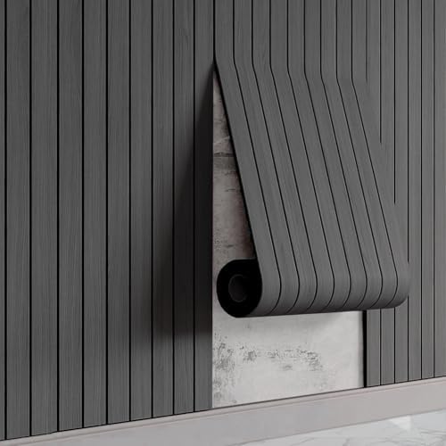
WaveSpace Black Oak Peel & Stick PVC Slat Wall Panels — 118″×15.75″
- Effortless Peel and Stick Wall Panels–Experience a quick and easy upgrade with our self-adhesive PVC slat panels; simpl…
- Stunning Realistic Oak Wood Panels–Achieve the warm, luxurious look of natural oak wood grain on your walls without the…
If you’re renting or simply don’t want to paint, these WaveSpace self-adhesive PVC slat panels create a dramatic feature wall that gives your living room the look of dark oak wood grain without paint. One panel covers 12.9 sq ft at 118″×15.75″. Scratch-resistant PVC surface, moisture-resistant, and the 3D design adds genuine visual depth. Perfect for a moody accent wall behind a sofa. For more renter-friendly approaches, see our article on 6 genius renter-friendly decor ideas. ASIN: B0GJ3Z22HR.
What to Put in the Corner of a Living Room
Corners are where living rooms go to die. Most people either ignore them entirely (leaving an awkward dead space) or fill them with something random that makes the room feel more cluttered, not more intentional. The secret is to use corners to reinforce the room’s color story.
The most effective corner solutions are: a statement accent chair (which adds both function and color), a floor lamp with a tall thin profile, or a grouping of vases at varying heights. If you’ve gone with sage green or warm neutral walls, a green boucle accent chair in the corner creates a tonal moment that feels collected and intentional — like you meant to do that all along. (Even if you just ran out of other ideas.)
For more corner and wall styling ideas, our guide to creative wall decor ideas for the living room has some great options that also work as corner anchors.
GUKJOB Gradient Pink Ceramic Vase Set of 3 — 10″H, 7.5″H, 5″H

- Versatile Small Vase For Decor – Decorate your living room, kitchen, bedroom, bathroom or office with these elegant smal…
- Handmade Small Ceramic Vases – (measuring 3”L x 3”W x 10”H; 2.9”L x 2.9”W x 7.5”H; 2.8”L x 2.8”W x 5”H) These vases are …
- High Quality Room Decoration Small Ceramic Vase – Our artistic textured ceramic vase set is made of 100% high quality ce…
This set of 3 gradient pink ceramic vases from GUKJOB is exactly what a corner shelf or side table needs. The staggered heights — 10″H, 7.5″H, and 5″H — create natural visual rhythm without looking staged. The ribbed texture adds interest, and the gradient pink tone works surprisingly well against both warm neutrals and sage green walls, adding a gentle warm accent. Waterproof coating inside, wide mouth, holds fresh flowers. 4.6 stars from 370 reviews. ASIN: B0FKGQG3DF.
How to Make Any Living Room Feel Cozy — Beyond the Paint
Paint color sets the stage, but coziness comes from layers. According to The Spruce, the most important cozy-making element in a living room isn’t paint — it’s texture. Rooms with multiple textures (soft fabric, natural wood, woven materials, smooth ceramics) consistently read as warmer and more inviting than rooms with uniform surfaces.
The practical formula: choose your wall color first (warm, mid-tone, or deep), then layer in at least three different textures. A corduroy throw pillow, a boucle accent chair, and a ceramic vase already give you three. Add a woven rug and a piece of framed wall art and you’ve got five distinct textures that make the room feel complete.
Lighting plays an equally important role. The type of warm ambient lighting that makes a living room feel cozy at night is what seals the entire color scheme together. Our guide on living room lighting ideas covers exactly how to layer light for maximum coziness. And if you want to go deeper on texture layering, our article on how to layer textures like an interior designer is worth a read.
” According to The Spruce (2024), rooms with five or more distinct texture types are rated as ‘significantly more inviting’ by homeowners than rooms with three or fewer — making texture layering the single highest-impact styling technique for creating coziness.”
The Products That Bring Your Living Room Color Story Together
Color theory is useful. But at some point, you need actual products that make the vision real. Here’s a quick summary of everything we’ve covered, all in one place.
For testing color: Samplize peel-and-stick samples in Cloud White OC-130, Pale Oak OC-20, Cushing Green HC-125, and Van Deusen Blue HC-156.
For texture: Fancy Homi corduroy pillow covers in neutral (set of 4, 18″×18″) and the SUNBURY green boucle swivel chair.
For wall interest: framed blue and gold abstract canvas art (36″×24″) and WaveSpace black oak slat wall panels for a renter-friendly feature wall.
For earthy accents: TILECLUB olive green ceramic tiles for fireplace surround or accent feature, and the GUKJOB gradient pink ceramic vase set for corner and shelf styling.
Frequently Asked Questions
Q: What is the most timeless living room color?
A: Warm white and greige (gray-beige) have proven the most enduringly popular living room colors across decades of design trends. Benjamin Moore’s White Dove OC-17, Cloud White OC-130, and Pale Oak OC-20 consistently appear in designer-recommended and homeowner-loved lists year after year.
Q: Can I use two colors in one living room?
A: Yes — the most common approach is a two-tone treatment with a lighter color on the upper wall and ceiling and a slightly deeper accent color on the lower wall or in built-in cabinetry. Keep the ceiling the lightest tone to maintain the sense of height. A second approach is using one wall color throughout and adding color through furniture, art, and textiles.
Before you go…
You know what color you want. But do you know how to make it look good on a wall that has no artwork, awkward proportions, or bare corners? The transformation doesn’t stop at paint.
Check out our guide to 8 stunning wall paint ideas that work in every room — including tricks for making any color look more intentional with the right decor layering.